Rootmenu
Business Services, HR & Staffing
Client Name: RootMenu
Requirement :
To create centralization of the CRA for managers, agents, commercial, SSII, providers and consultants in order to manage their online signature, document management & automatic transmission to your departments for purchase, payroll, and invoicing.
Technology used :
Angular 10
Node Js
Bootstrap 4
Primengx
Implementation :
The project took about — days from concept to go-live.
About Company :
Mon CRA, when translated into English, is also Root-MENU is the creator of My CRA.
Root-MENU is a French company that is a PARTICIPATING PLATFORM FOR ESN/SSII BUSINESSES that connects end customers and consultants through the philosophy of diminishing margins via a collaborative SaaS solution.
Root-MENU intends to be THE NEW LABEL, ensuring openness, clarity, responsibility, and sharing of all money flows inspired by the provision of services and the delegation of persons.
ROOT MENU reduces its own margin in complete transparency in order to set up the reducing margin.
The Root-MENU Certified Agent will ensure the quality of the Middle Men’s actions: Expert Agent, Commercial, HRD, Recruiter, and Business Engineer.
Summary Story:
RootMenu wanted to build a platform that would centralize the CRA and manage their online signature, document management, and automatic transmission to your departments for purchases, payroll, and invoices, where their CRA is pre-formatted and filled out for managers, agents, commercial, SSII, providers, and consultants. Along with secured document management, automatic transmission to their manager, and their online electronic signature, they also wanted backup and archiving for 10 years.
Key considerations and requirements during this implementation were:
-
Domain
-
Access to all designs, photographs and content as per requirement
-
Web Hosting
-
SSL
Our Deliverables Included the following required Knowledge and skills:
-
NODE Server
-
ANGULAR
-
GIT
-
Send Grid/SendinBlue Account
-
CMS Admin (App Service, Plan app service, Server SQL, database SQL)
Discovery & UX Strategy :
When Root-Menu approached us, they were looking for a solution to centralize the CRA for managers. Our investigation into the source of design inspiration played a significant role. Since Root-Menu was a startup, we had the opportunity to dig deeply into a number of exercises that influenced our design philosophy. After the discovery phase, we were prepared to begin developing our UX strategy and wireframes.
The next step after finishing the discovery phase was to plan and define the site’s information architecture. After establishing the site architecture, we started developing wireframes (which serve as our blueprints to build the site in the next phase). Wireframes made it simple for us to describe the user journey.
How to keep the user journey moving forward was a key area of focus during the wire framing phase. This was accomplished by placing large CTAs at the end of each page to nudge visitors to proceed to the next logical stage of their journey.
Building the Website :
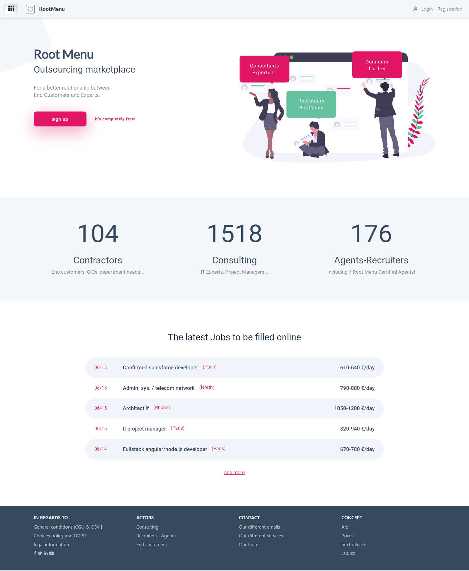
We began developing the new website after we had completed the framework’s architecture, testing, and approval. We used a harmonious balance of whitespace, eye-catching visual imagery, and typographical styling to emphasize the value propositions provided by Root-MENU and give the site a contemporary appearance.
Additionally, we used bold applications of their provided branded colour palette to highlight important information in order to improve the visual organization and raise the likelihood of conversion. This was done to ensure that the site’s overall messaging was direct, succinct, and professional.
After the design phase, we jumped right into building their unique website on the platform. We designed the custom backend to be user-friendly and organized so that Root-MENU could easily update the content on the website in the future. As an added bonus, we added subtle animations to the site during development to give it more polish and appeal.
Test & Launching :
We were ready for launch after months of hard work and preparation. We were confident that the site was ready to go live after extensive testing on multiple browsers and devices.
Root-MENU chose to host their site with us, which facilitated the setup of the live environment. After developing a launch strategy and ensuring that all of the pieces were in place, the domain was pointed and the site was made available to the public. Everyone was able to sit back and proudly browse the beautiful new website after months of hard work and preparation.
The Results :
The website’s successful launch was a joy because it was the result of our team’s months of commitment and effort. But even though this deserving company now has a beautifully designed website that accurately portrays them as true authorities in their field that was just the beginning of the wonderful experience that lay ahead because we are still working with them to make additional improvements.
The company is happy with the early results and believes that this new website will play a significant role in moving their business in the right direction. The new Root-MENU website has made it simple for visitors to find exactly what they’re looking for within their first few minutes of being on the site thanks to its ease of use and a modernized look.


