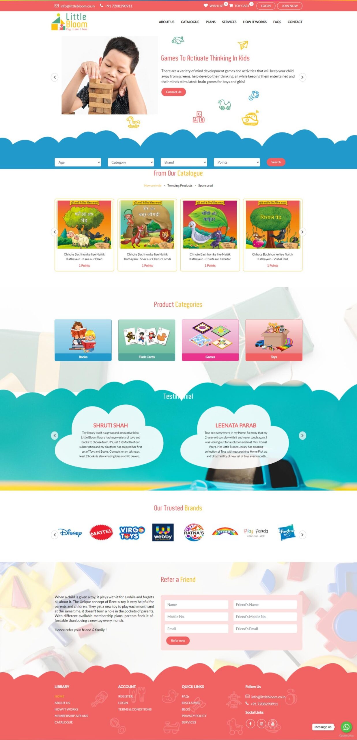
Requirement :
To create front-end website and admin panel for kids ecommerce which includes toys, books and puzzles along with membership and point system in application.
Technology used :
Angular
Node Js
Bootstrap4
Primengx
Implementation :
The project took about 60 days from concept to go-live.
About Company :
Little Bloom Kids Library is an Online Child Friendly Library, where they provide kids safe, hygienic and meaningful Toys and Books at the comfort of their home. So we usually see that Kids easily get bored with same toys and books at home, and practically to buy new toys every time is difficult for parents also. So, Parents are struggling to keep their child active, engaged, happy and at the same time teach them new concepts every day. That’s when Little Bloom comes into the Story.
They help you avoid the additional expenses every month, the toys cluttering your home, and constantly arranging your house space because all of it by providing you Hassel free, Pocket Friendly and wide range of Books and Toys on rent.
Their Tagline is : So Why Buy, When Customer Can Rent?
Summary Story:
Little Bloom wanted to create a platform in order to encourage parents of kids & toddlers to rent toys, books and games matching their needs and place order online on their Website. They also wanted encourage the parents for membership benefits and place orders against their membership plan from the inventory available in the ecommerce platform.
Key considerations and requirements during this implementation were:
-
Domain
-
Access to all designs, photographs and content as per requirement
-
Web Hosting
-
SSL
Our Deliverables Included the following required Knowledge and skills:
-
NODE Server
-
ANGULAR
-
GIT
-
Send Grid/SendinBlue Account
-
CMS Admin (App Service, Plan app service, Server SQL, database SQL)
Discovery & UX Strategy :
After accumulating all of the data from our interviews, audits, and studies, our research team analyzed everything. We used what we learnt from our deep dive into data to develop the design’s user experience strategy (UX).
The first thing we concentrated on was building a new and more efficient site map that streamlined access to the key specifics visitors were looking for. We designed the website map and content strategy. The content strategy was critical to ensure that only up-to-date and relevant information was on website which was provided by the client, and it assisted us in identifying content gaps that occurred where new content would need to be developed to integrate on the website. After the site map and content strategy were established, it was time to wireframe the site’s structure.
Building the Website :
When the structural planning was complete, we could move on to the exciting phase of design. We selected the hues, graphics, typefaces, and iconography that would most accurately convey the essence of Little Bloom through design. We selected an approachable, upbeat, and welcoming sans serif font for the site’s fonts in order to allude to Little Bloom’s upbeat mission. The website’s colour scheme was chosen in accordance with the client’s specifications. During this stage, we planned small animations that suggested upward motion.
Everything on the site’s backend was modified and organized in a way that allows Little Bloom to maintain the site fresh and up to date. The site’s front-end development makes use of the most recent code on a responsive framework to provide an ideal experience for website users on devices of all sizes and shapes. Whether someone visits on a tiny mobile phone or a massive desktop computer, the site will always be simple to explore and connect with.
Test & Launching :
We extensively planned, designed, and developed the ideal website before testing it on a variety of mobile and desktop devices and browsers to ensure a globally accessible and smooth experience.
We used an Agile/Scrum methodology throughout the project, working with the key stakeholders at Little Bloom to incorporate their comments into the project while getting the pieces and pages ready for launch as we went. This method enabled our team to test and get useful customer feedback at an early stage, avoiding last-minute hiccups.
In accordance with Agile standards, we made the MVP version of the site available to the public once it was ready. As more pages and parts became available, they were rolled out with accuracy throughout subsequent iterations.
The Results :
Little Bloom has been overjoyed with their new website, and the improvements in key performance indicators (KPIs) we’ve seen through analytics suggest that website visitors are discovering what they’re searching for and engaging with the site. Little Bloom’s visibility has also enhanced as a result of improved SEO.
We continue to iterate, adjust, and improve the site based on comments and observations of how it is utilized. The site is a living, breathing extension of why Little Bloom is such a strong player in their area, and the positive feedback from visitors regarding their use of the site has been tremendously pleasant to hear.


